


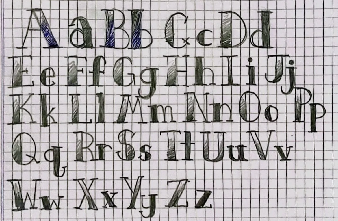
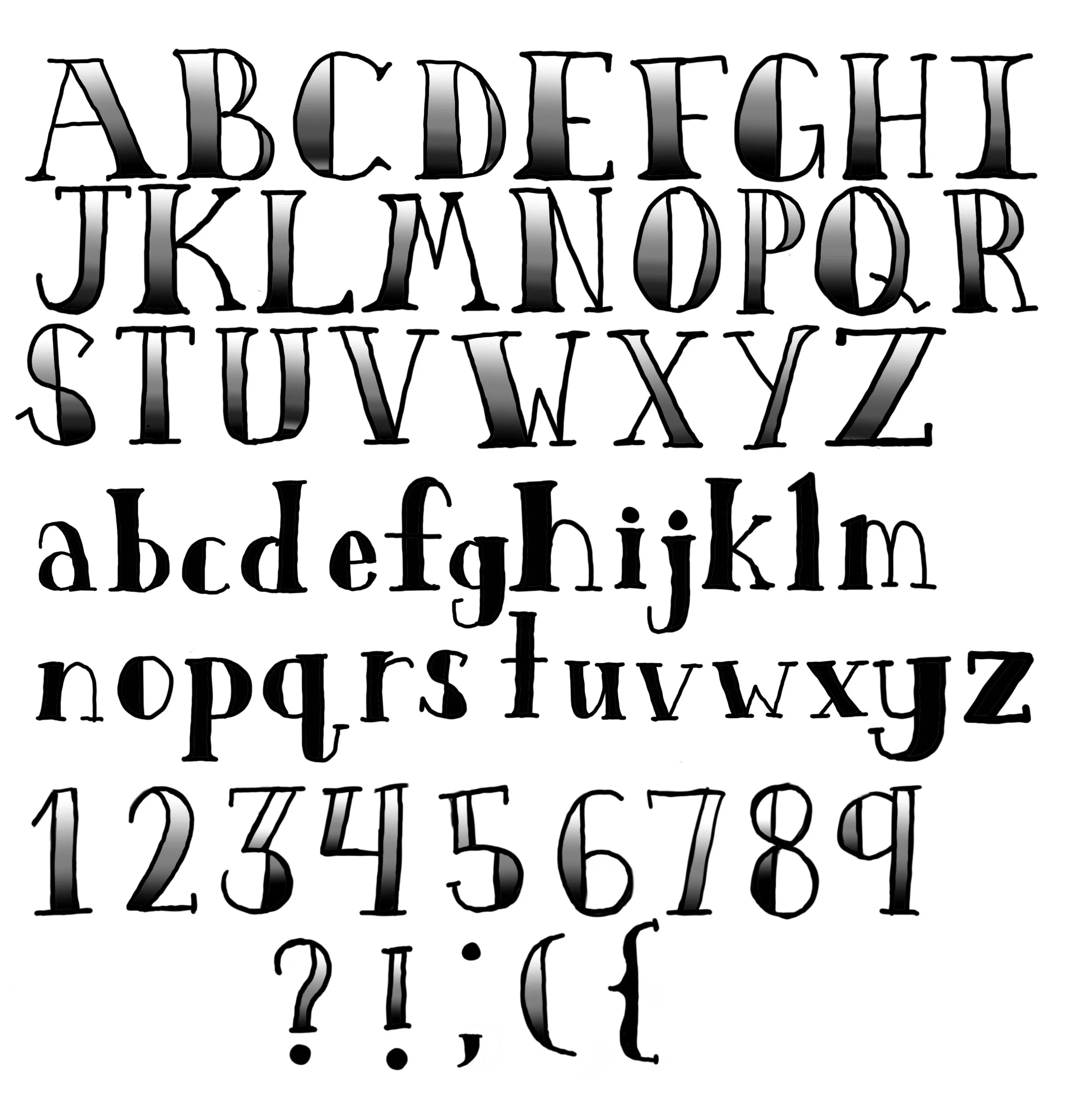
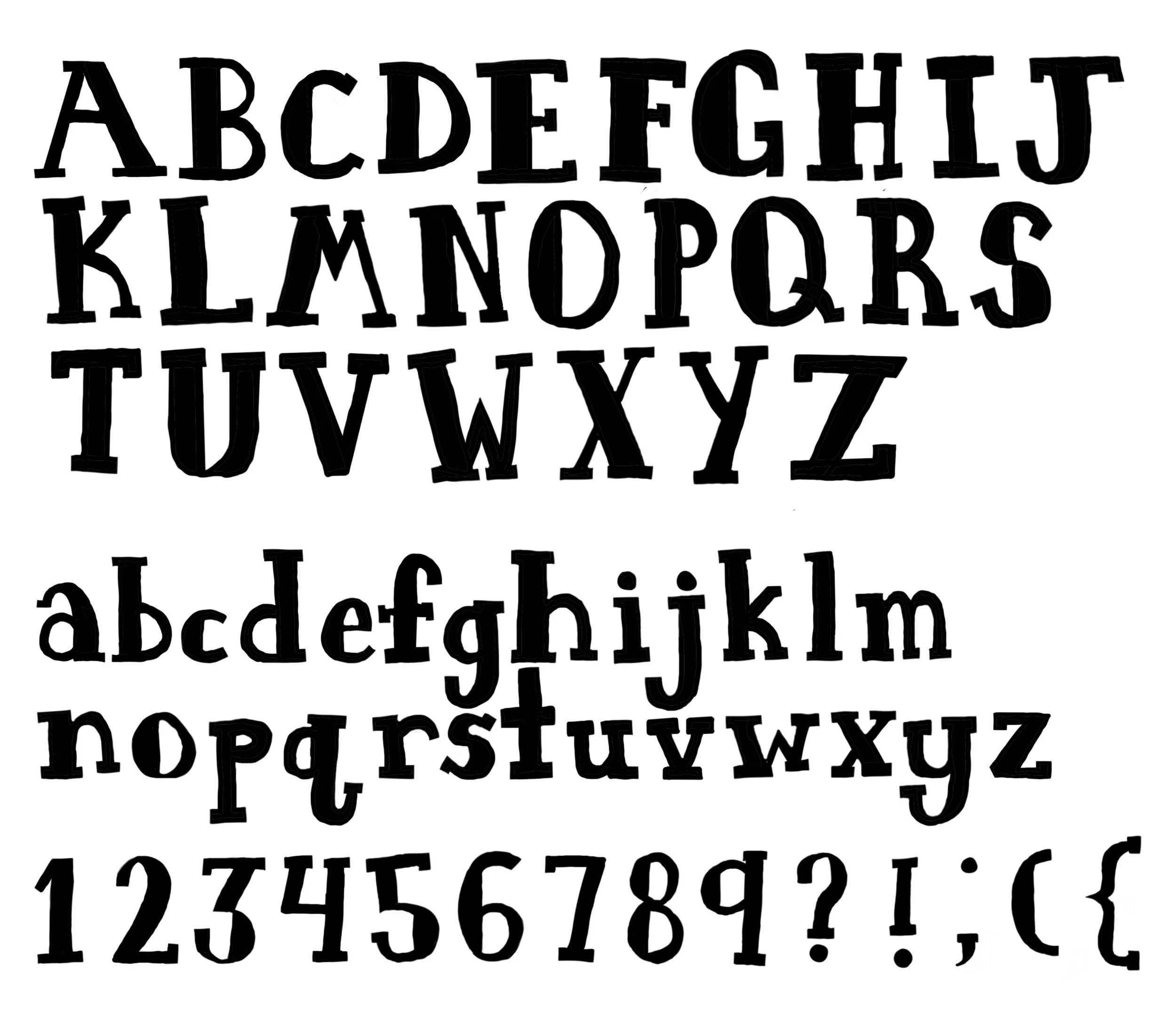
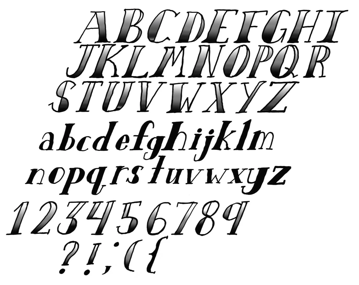
For my typography project, I created a hand-drawn typeface inspired by playful imperfections. The process began with sketching individual letterforms using pencil and paper, focusing on consistency in style while allowing for subtle variations that highlight the human touch. After refining the sketches, I digitized the letters and adjusted spacing and alignment for better readability. The final typeface balances personality and function, making it suitable for creative headings and expressive design work. This project taught me the importance of rhythm, contrast, and cohesion in type design, while celebrating the uniqueness of handcrafted typography.