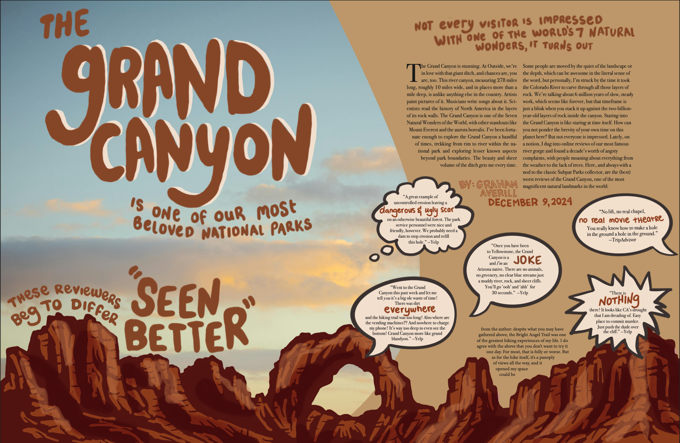
final design
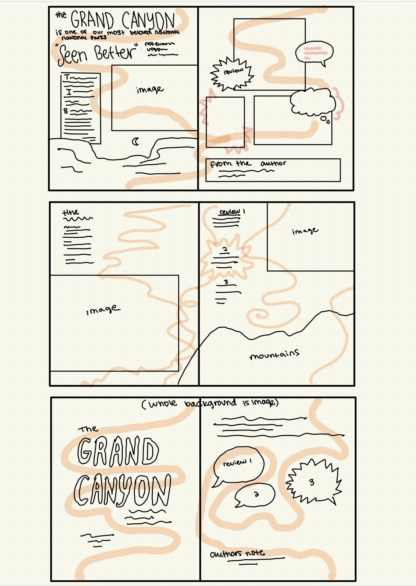
initial sketches
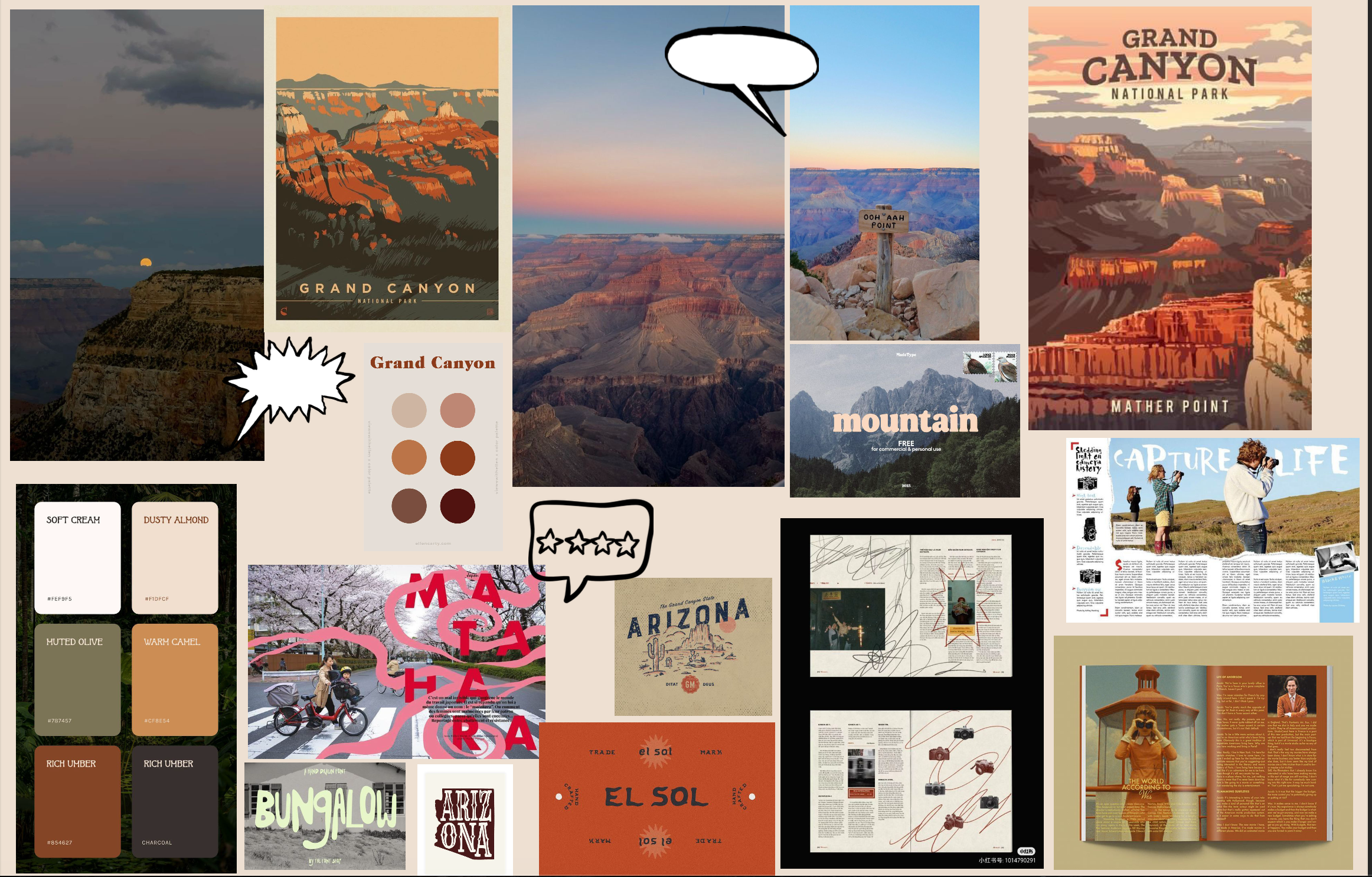
moodboard
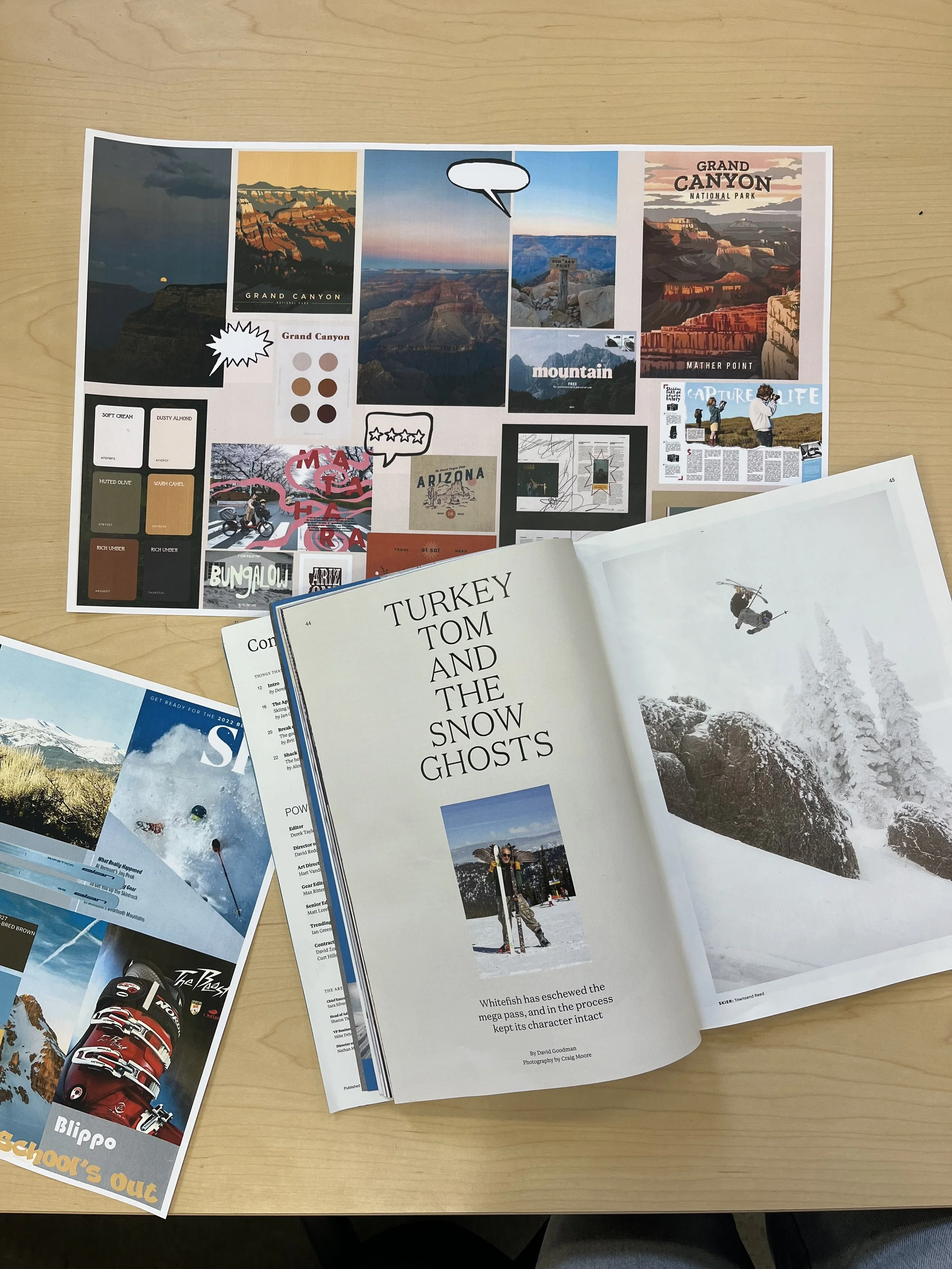
rough draft
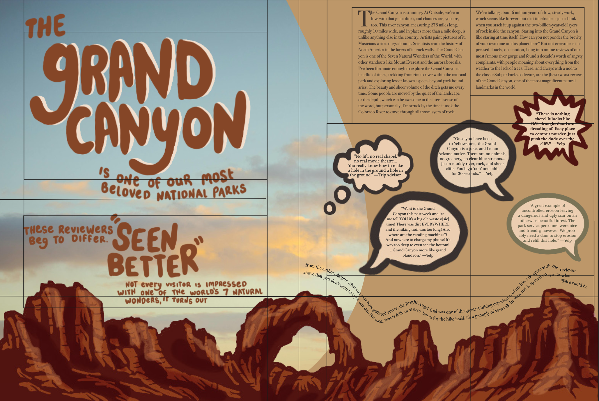
For this project, I redesigned a magazine spread for an article on the surprising opinions of people who think the Grand Canyon isn’t that special. I started with a moldboard with font and layout ideas. I placed the reviews in hand-drawn speech bubbles to add humor. The layout contrasts the vast beauty of the canyon with the blunt comments to create a playful, ironic tone. Through bold hand-drawn typography, composition, and visual contrast, the design invites viewers to reflect on how perspective shapes experience, while also having a bit of fun with the idea.